 |
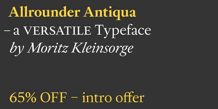
Right after Allrounder Grotesk and Allrounder Monument, it’s time for the third member of the Allrounder Collection by Moritz Kleinsorge. Please welcome Allrounder Antiqua.
Allrounder Antiqua is a classic and timeless typeface, perfectly suitable for editorial and brand design. The lowercase a with its small and sharp counter provides a distinctive recognition feature, that will always stand out nicely.
While its main purpose is to set very legible body copy with an even color, its refined shapes also shine in display sizes and let you create elegant packaging, even for food, fashion or consumer goods, and lifestyle branding. It is also suitable as a strong corporate typeface, be it for a more conservative venture or the latest hipster start-up.
This classy serif typeface comes in four weights with corresponding true italics. And for sure, just like the workhorse Allrounder Grotesk, Allrounder Antiqua is also equipped with plenty of Opentype Features like small caps, six sets of figures, case-sensitive forms, superiors, fractions and many ligatures. You will find alternate letters with swashes within this extended character set, as well as all the accented glyphs necessary to support more than 200 Latin-based languages.
Allrounder Antiqua: Historical Background
The (french) renaissance inspired typeface started as Moritz Kleinsorge’s graduation project within the „Expert class Type design” course of the Plantin Institute for Typography, located in the famous Museum Plantin-Moretus in Antwerp, Belgium. There, Moritz Kleinsorge decided to create a revival of Robert Granjons Ascendonica Romain, which is described as „a beautiful face; typical of Granjon’s mature style” within the inventory book of available punches and matrices. To touch punches and matrices cut by Robert Granjon back in 1567 was an unbelievable feeling, he explained. Over time, the typeface moved away from being a true revival, becoming rather a Granjon inspired typeface.
Allrounder Grotesk: Perfect Pairing
Allrounder Grotesk is the ideal complement to Allrounder Antiqua. They both share the same vertical matrices and color, so you can pair both typefaces within a text without creating a visual disruption. Head over to the Family Page of Allrounder Grotesk to get more information about this typeface. There you will also find the matching four weights (plus italics) as a value pack called „Allrounder Antiqua Complement” for a special price. With this pack – and Allrounder Allrounder Antiqua – all your design dreams come true for matching type with ease.
Design Trick: Bilingual Design with the Allrounder Superfamily
The combination of Allrounder Grotesk and Allrounder Antiqua is ideal for bilingual designs, wherein both languages get the same emphasis by two different typefaces. And of course, setting headlines with different but matching typefaces is a strong visual practice.